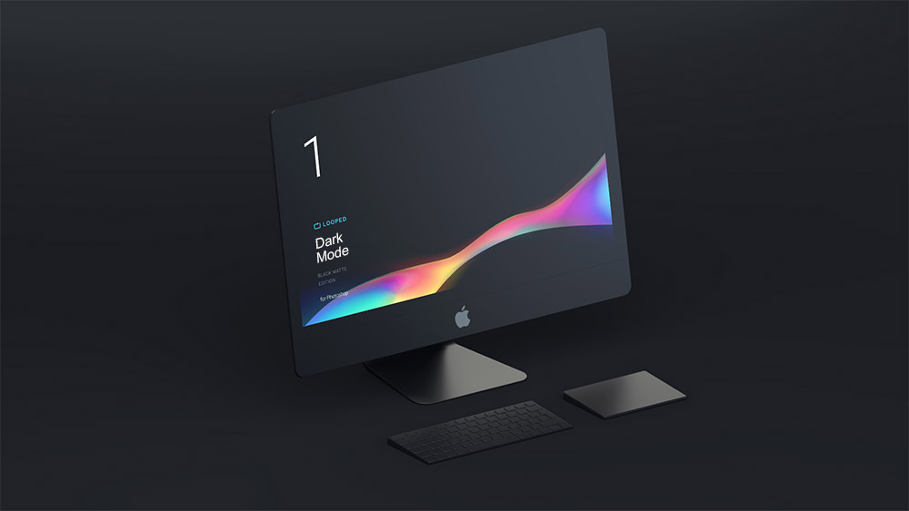
 How to Automatically Respond to CSS Dark Mode Based on System Theme
# How to Automatically Respond to CSS Dark Mode Based on System Theme
Many people prefer dark mode in apps or websites, either because they like the look or to reduce eye strain. This article shows you how to implement automatic CSS dark mode on your website, responding to the visitor's system theme.
# CSS Dark Mode
Define variables in the :root element to set theme colors. I recommend doing the same, as it makes the process much easier. The variables I defined are:
:root {
  --bg: #fff;
  --textColor: #004050;
  --borderColor: rgba(0,0,0,.15);
}
2
3
4
5
:root这个 CSS 伪类匹配文档树的根元素。对于 HTML 来说,:root表示<html>元素,除了优先级更高之外,与html选择器相同。
To use these variables in your stylesheet, you can do this:
body {
  color: var(--bg);
}
2
3
This way, if you want to change your theme colors, all you need to do is modify the variables you defined, and all styles using them will be updated.
Now we need to define a new set of variables that will be used when CSS dark mode is activated. My dark mode variables look like this:
/* Define dark mode colors */
:root {
  --bg: rgb(30,30,34);
  --textColor: rgb(150,150,154);
  --borderColor: #2C2C3A;
}
2
3
4
5
6
# Adding Automatic Dark Mode Response
Now we have two sets of variables defined. The remaining step is to add the prefers-color-scheme media query to our dark mode variables.
Wrap your dark mode variables with an @media query:
/* Respond to system dark mode with dark variables */
@media (prefers-color-scheme: dark) {
  :root {
    --bg: rgb(30,30,34);
    --textColor: rgb(150,150,154);
    --borderColor: #2C2C3A;
  }
}
2
3
4
5
6
7
8
That's it! If someone using a dark mode system theme visits your website, it will automatically switch to dark mode.
If your computer's OS doesn't support dark mode, you can test on a phone -- first switch the phone's system theme to dark mode, then open your website.
# Detecting Dark Mode with JS
If you need JavaScript to determine whether the system is in dark mode, you can do this:
if(window.matchMedia('(prefers-color-scheme: dark)').matches){
  // Dark theme
}
2
3
matchMedia(opens new window)方法返回一个MediaQueryList(opens new window)对象,该对象具有属性matches、media,具有方法addListener、removeListener。
addListener accepts a MediaQueryList object as a parameter.
Add listeners for dark mode to respond to system theme switches:
let listeners={
  dark:(mediaQueryList )=>{
    if(mediaQueryList.matches){
      alert('You switched to dark mode!')
    }
  },
  light:(mediaQueryList)=>{
    if(mediaQueryList.matches){
      alert('You switched to light mode!')
    }
  }
}

window.matchMedia('(prefers-color-scheme: dark)').addListener(listeners.dark)
window.matchMedia('(prefers-color-scheme: light)').addListener(listeners.light)
2
3
4
5
6
7
8
9
10
11
12
13
14
15
# Conclusion
We can not only respond to different screen sizes in terms of layout, but also respond to dark mode based on the system theme. I'm sure your late-night visitors, or those who prefer dark mode, will thank you.