 Flex Layout Syntax
# Flex Layout Syntax
# 1. What Is Flex Layout?
Flex stands for Flexible Box, meaning "flexible layout," designed to provide maximum flexibility for the box model.
Any container can be designated as a Flex layout.
.box{
  display: flex;
}
2
3
Inline elements can also use Flex layout.
.box{
  display: inline-flex;
}
2
3
WebKit-based browsers require the -webkit prefix.
.box{
  display: -webkit-flex; /* Safari */
  display: flex;
}
2
3
4
Note: Once Flex layout is set, the float, clear, and vertical-align properties of child elements become ineffective.
# 2. Basic Concepts
An element with Flex layout is called a Flex container (flex container), or simply "container." All its child elements automatically become container members, called Flex items (flex item), or simply "items."
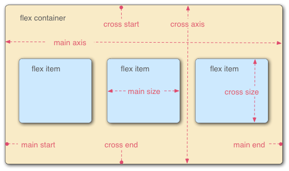
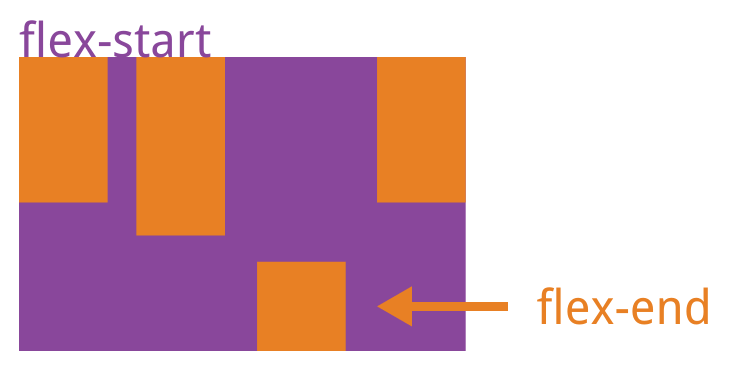
The container has two axes by default: the horizontal main axis (or x-axis) and the vertical cross axis (or y-axis). The starting position of the main axis (where it intersects the border) is called main start, and the ending position is main end; the starting position of the cross axis is called cross start, and the ending position is cross end.
Items are arranged along the main axis by default. The main axis space occupied by a single item is called main size, and the cross axis space is called cross size.
# 3. Container Properties
The following 6 properties are set on the container (i.e., the element with display: flex).
flex-direction Direction Determines the arrangement direction of items
flex-wrap Wrapping
flex-flow Shorthand for direction and wrapping
justify-content Main axis alignment
align-items Cross axis alignment
align-content Multi-line alignment
# 3.1 flex-direction Property
The flex-direction property determines the direction of the main axis (i.e., the arrangement direction of items).
.box {
  flex-direction: row | row-reverse | column | column-reverse;
}
1
2
3
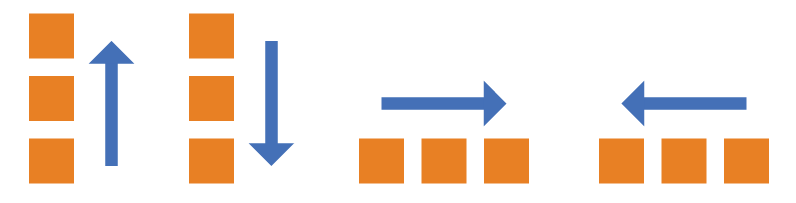
It can take 4 values.
row(default): Main axis is horizontal, starting from the left.row-reverse: Main axis is horizontal, starting from the right.column: Main axis is vertical, starting from the top.column-reverse: Main axis is vertical, starting from the bottom.
# 3.2 flex-wrap Property
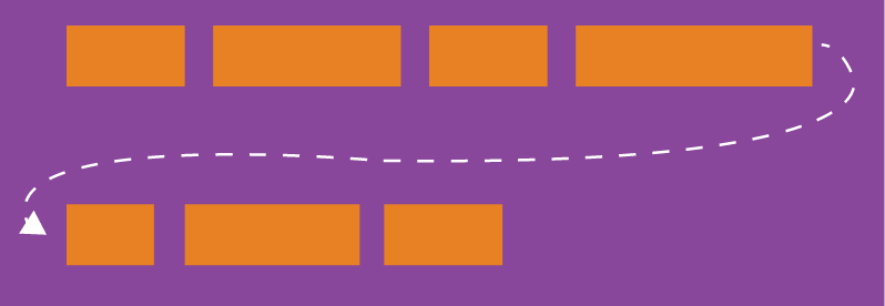
By default, all items are arranged on a single line (also called an "axis line"). The flex-wrap property defines how to wrap if items don't fit on one line.
.box{
  flex-wrap: nowrap | wrap | wrap-reverse;
}
1
2
3
It can take three values.
(1) nowrap (default): No wrapping. May compress item widths.
(2) wrap: Wrap, with the first row on top.
(3) wrap-reverse: Wrap, with the first row on the bottom.
# 3.3 flex-flow
The flex-flow property is a shorthand for flex-direction and flex-wrap, with a default value of row nowrap.
.box {
  flex-flow: <flex-direction> || <flex-wrap>;
}
1
2
3
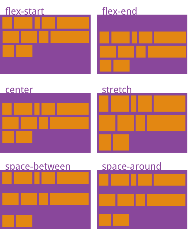
# 3.4 justify-content Property
The justify-content property defines item alignment along the main axis.
.box {
  justify-content: flex-start | flex-end | center | space-between | space-around;
}
1
2
3
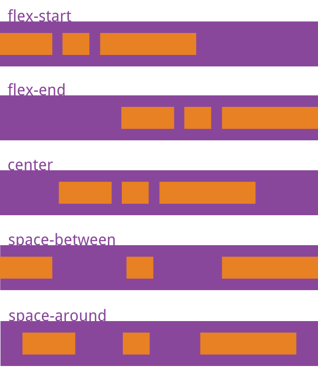
It can take 5 values. The specific alignment depends on the axis direction. Below assumes the main axis goes from left to right.
flex-start(default): Align to the leftflex-end: Align to the rightcenter: Centerspace-between: Justify; equal spacing between items.space-around: Equal spacing on both sides of each item. Therefore, the spacing between items is twice the spacing between items and the border.
# 3.5 align-items Property
The align-items property defines how items are aligned along the cross axis.
.box {
  align-items: flex-start | flex-end | center | baseline | stretch;
}
1
2
3
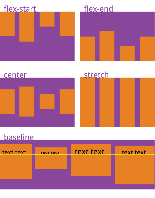
It can take 5 values. The specific alignment depends on the cross axis direction. Below assumes the cross axis goes from top to bottom.
flex-start: Align to the start of the cross axis.flex-end: Align to the end of the cross axis.center: Align to the center of the cross axis.baseline: Align to the baseline of the first line of text in each item.stretch(default): If items have no height set or are set to auto, they will fill the entire container height.
# 3.6 align-content Property
The align-content property defines the alignment of multiple axis lines (one row of items forms one axis line). This property has no effect if there is only one axis line.
.box {
  align-content: flex-start | flex-end | center | space-between | space-around | stretch;
}
1
2
3
This property can take 6 values.
flex-start: Align to the start of the cross axis.flex-end: Align to the end of the cross axis.center: Align to the center of the cross axis.space-between: Align to both ends of the cross axis, with equal spacing between axis lines.space-around: Equal spacing on both sides of each axis line. Therefore, the spacing between axis lines is twice the spacing between axis lines and the border.stretch(default): Axis lines fill the entire cross axis.
# 4. Item Properties
The following 6 properties are set on items.
orderflex-growflex-shrinkflex-basisflexShorthand forflex-grow,flex-shrink, andflex-basisalign-self
# 4.1 order Property
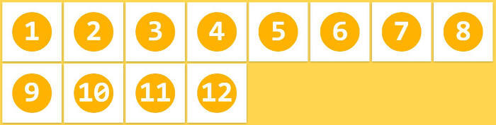
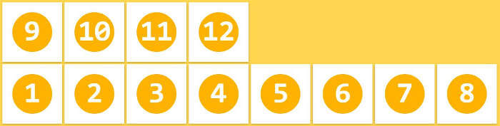
The order property defines the order of items. The smaller the value, the higher the priority. Default is 0.
.item {
  order: <integer>;
}
1
2
3
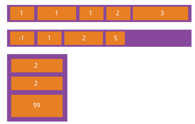
# 4.2 flex-grow Property
The flex-grow property defines the growth ratio of an item. Default is 0, meaning no growth even if there is remaining space.
.item {
  flex-grow: <number>; /* default 0 */
}
1
2
3
If all items have flex-grow set to 1, they will equally share the remaining space (if any). If one item has flex-grow set to 2 while others are 1, the former will take up twice the remaining space compared to others.
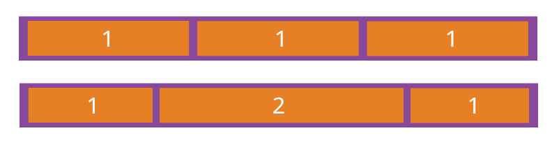
# 4.3 flex-shrink Property
The flex-shrink property defines the shrink ratio of an item. Default is 1, meaning the item will shrink if space is insufficient.
.item {
  flex-shrink: <number>; /* default 1 */
}
1
2
3
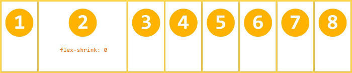
If all items have flex-shrink set to 1, they will all shrink proportionally when space is insufficient. If one item has flex-shrink set to 0 while others are 1, the former will not shrink when space is insufficient.
Negative values are invalid for this property.
# 4.4 flex-basis Property
The flex-basis property defines the main axis space (main size) an item occupies before remaining space is distributed. The browser uses this property to calculate whether the main axis has remaining space. Its default value is auto, meaning the item's original size.
.item {
  flex-basis: <length> | auto; /* default auto */
}
1
2
3
It can be set to the same value as width or height (e.g., 350px), and the item will occupy a fixed amount of space.
# 4.5 flex Property
The flex property is a shorthand for flex-grow, flex-shrink, and flex-basis. Default value is 0 1 auto. The last two properties are optional.
.item {
  flex: none | [ <'flex-grow'> <'flex-shrink'>? || <'flex-basis'> ]
}
1
2
3
This property has two shortcut values: auto (1 1 auto) and none (0 0 auto).
It is recommended to use this shorthand property rather than writing three separate properties, as the browser will calculate the related values.
# 4.6 align-self Property
The align-self property allows a single item to have a different alignment than other items, overriding the align-items property. Default value is auto, meaning it inherits the parent element's align-items property. If there is no parent element, it is equivalent to stretch.
.item {
  align-self: auto | flex-start | flex-end | center | baseline | stretch;
}
1
2
3
This property can take 6 values. Except for auto, all are identical to the align-items property values.
(End)
Source:
http://www.ruanyifeng.com/blog/2015/07/flex-grammar.html (opens new window)
http://www.ruanyifeng.com/blog/2015/07/flex-examples.html (opens new window)